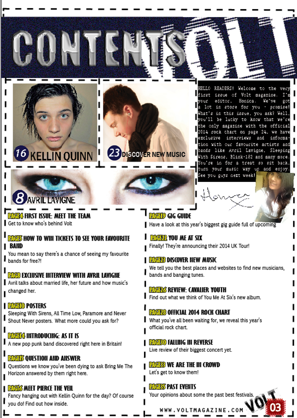
In my first draft on the contents page, I have included the pictures linking to the pages, created a banner at the top where it says 'contents'. I didn't know where to put the logo for my magazine as everywhere I tried looked odd or distracting. I decided to make it part of the background of my contents banner which I think works well.
In my second draft, I added dashed lines to section the page. This makes the page look busier, and that's the look I'm going for. I also added the page number, the logo and magazine website at the bottom right of the page. I made the page number graphic red to make it stand out.
In my final draft, I added the page numbers and titles. I made the page numbers yellow and the titles black to continue the yellow and black 'warning' theme. I put little annotations about the page below them to tell the reader more information about what on the page. I added an editor's letter to make it more personal, so I can introduce the magazine and myself. I also added a picture of myself and signed it. By putting a black background to my editor's letter, it makes the letter stand out and I can make that a recurring theme for ongoing issues.


No comments:
Post a Comment